The first week of the poster series is based around the axial typographic system. I have made 3 posters so far, but can only turn in two. I've got to figure out which two those will be...
My vote is for # 1. I like the feel of the blue color. The X design looks like a map of an island with mountains. I also like the type. It is easy to read and pleasing to the eye.
My second choice is # 3. On all 3 posters, I wonder if the sponsorship should be more prominent.
Thanks. The X is actually a chromosome, which comes from a line in one of her songs. I like the type in the first poster too, but it's actually too big (specifically the body text). These are 11" x 17", so legibility shouldn't be a problem at that size.
Also, the sponsorship is necessary to include, but it really takes away from the design, so I didn't like making it bigger.
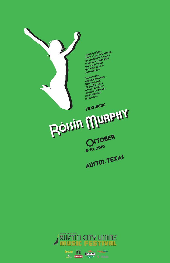
Thanks for your feedback on my ideas, yo. :) I vote for the second and third posters. I really like the chromosome idea in the first one but it reminds a little too much of something that might be equally appropriate in a science text book (don't take that as an insult-- it's still a great looking poster). I think the retro feel and ratio of the size of the display text vs. the body text in the third one works the best. Plus I love the simplicity of the silhouette. I think both the second and third posters have the most effective streamlined designs that highlight the important details.
Thanks Kim. I completely agree, the chromosome was the first one I did and I think they got better with each one. The green is my favorite I think. I can't wait to see yours.


My vote is for # 1. I like the feel of the blue color. The X design looks like a map of an island with mountains. I also like the type. It is easy to read and pleasing to the eye.
ReplyDeleteMy second choice is # 3. On all 3 posters, I wonder if the sponsorship should be more prominent.
Thanks. The X is actually a chromosome, which comes from a line in one of her songs. I like the type in the first poster too, but it's actually too big (specifically the body text). These are 11" x 17", so legibility shouldn't be a problem at that size.
ReplyDeleteAlso, the sponsorship is necessary to include, but it really takes away from the design, so I didn't like making it bigger.
Thanks for your feedback on my ideas, yo. :) I vote for the second and third posters. I really like the chromosome idea in the first one but it reminds a little too much of something that might be equally appropriate in a science text book (don't take that as an insult-- it's still a great looking poster). I think the retro feel and ratio of the size of the display text vs. the body text in the third one works the best. Plus I love the simplicity of the silhouette. I think both the second and third posters have the most effective streamlined designs that highlight the important details.
ReplyDeleteThanks Kim. I completely agree, the chromosome was the first one I did and I think they got better with each one. The green is my favorite I think. I can't wait to see yours.
ReplyDelete