Showing posts with label Graphic Design. Show all posts

Tuesday, March 29, 2011

Graphic Design Project #1

Graphic Design Studio is a course set up to run like working in a Graphic Design Studio. We are assigned groups and then do work for clients.

Our first client was the Food Bank of Delaware. We chose from 3 different programs to create material for. My group chose the progam "Plant a Row". This program gets people with a garden to plant a little extra and then donate their surplus to the Food Bank so that needy people can receive a nutritious diet.

Our group created a poster, a small brochure, and an email blast.  I haven't documented anything printed out, and the brochure is really best seen printed out, since it has folds. (so I haven't included it in this post)

We wanted to have a tone that was encouraging and approachable. We used white space in a way that would work for the printing situation. Since the Food bank will be printing these in-house, we incorporated a border that doesn't bleed to the edge of the paper into our image.

The client chose to put our poster and email blast into production.


Monday, November 15, 2010

Lots of STUFF

I realize that I don't use this blog a lot anymore. The truth is that tumblr is much easier to use and I get a lot more out of it, from other people.  Regardless, I'm gonna catch up on this one, and just post a bunch of stuff that I have been working on recently.

From Typography III

This is a logo I created, based on two randomly assigned initials.  The assignment was to take the two letters, make up a clothing company, and a logotype to go with it, and then use it as a pattern to create a wallpaper for the store.

The store I created was called "Jr." and is a clothing company in Upper east side Manhattan that sells private school uniforms on one side, and casual wear on the other side of the store. One-stop shopping. The target market is boys in grades k-6.  For my concept, I created two wallpapers: one for the casual side of the store (left), and one for the uniform side (right).
 

There's one project I haven't received back yet, and I haven't documented it. It involved hand-lettering.

The next project was a kinetic type video. We had to choose a song, and animate the lyrics in flash. The best way to view it is at www.adammendala.com/indestructible

In Form & Communication III,

One project was to "package the intangible".

The initial concept I was working on was packaging "The Next Big Thing", i.e. big ideas like The Internet, Beanie Babies, Pokemon, Facebook, etc...but as a package containing the next big thing, whatever it may be. This is as far as I got before I decided that I just didn't know what to do with it:

While I was working on this, my friend Amy came into the studio, and said "isn't weird how oranges have such big pores?". This sparked an idea in my head, because it reminded me of an annoying girl complaining about her look or something. I decided to illustrate several fruit complaining about their bodies:

This was originally just a personal project, but then I realized I could make it work for my packaging project, by packaging "insecurity".  I developed them into juice boxes that contain 0% of certain vitamins/chemicals that are usually present in these juices. The absence of them affects your mood/self esteem negatively.


The next project was Book Covers. We were to pick an author who has done at least 3 novels/books, and then create a cover for each one.  I chose Margaret Atwood, who I like and have read 3 of her novels. I would like to print these out and photograph them actually covering the books, but here are the digital files. All of the photography is my own.


As a personal project and a favor for a friend, I redesigned the website for Students for the Environment at UD. I also modified a project in my Interactive Media class to use this for that class as well.

It will hopefully go live by the end of this year.

The project after book covers in F&C III was a social cause poster. I decided to keep the ball rolling with S4E and use them for my social cause. They were working on an oil spill fundraiser at the time, so I used that as a starting point. I referenced 60s Psychadelic type posters. The concept is the oil dirtying the pristine environment.  I screen-printed an edition of 25 and I'm selling them for $10 each with all of the proceeds going to The Solar Electric Light Fund to sustainably rebuild Haiti. I spent $70 of my own money on paper for this, and put a lot of hours into it, so I hope they all sell. So far it's going very well and I expect to be sold out by years end.

More photos and info can be found at www.adammendala.com

Another screen-print I did (I'm taking a screen-printing class) was this little guy. 
I was just brainstorming in class.

That pretty much catches you up with what I've been up to this semester that I hadn't previously posted.

Thursday, August 12, 2010

Logo Design

A friend of mine asked me to design a logo for a new company/website he and a friend are starting. It's called Early Risers, a site for up and coming young politicians/campaigners/political junkies.  His editor had a few ideas of her own, which I played with, and then I also took my own take on things with the later designs.


Here is a link to his already very successful website, The Politicizer

Wednesday, May 12, 2010

Cover for Form/Comm Book


For the Form and Communication book, we each have to design a cover, and in class, we will decide on whose we actually want to use. I decided to look back to the iconography project for my inspiration for this, and I like to imagine that each one of these animals has its own voice.

Back Cover:

Thursday, April 22, 2010

ACL Festival Companion Book

Now that we're finished creating posters for the ACL festival, we're moving on to creating a book for...

THE ACL FESTIVAL! YAYY

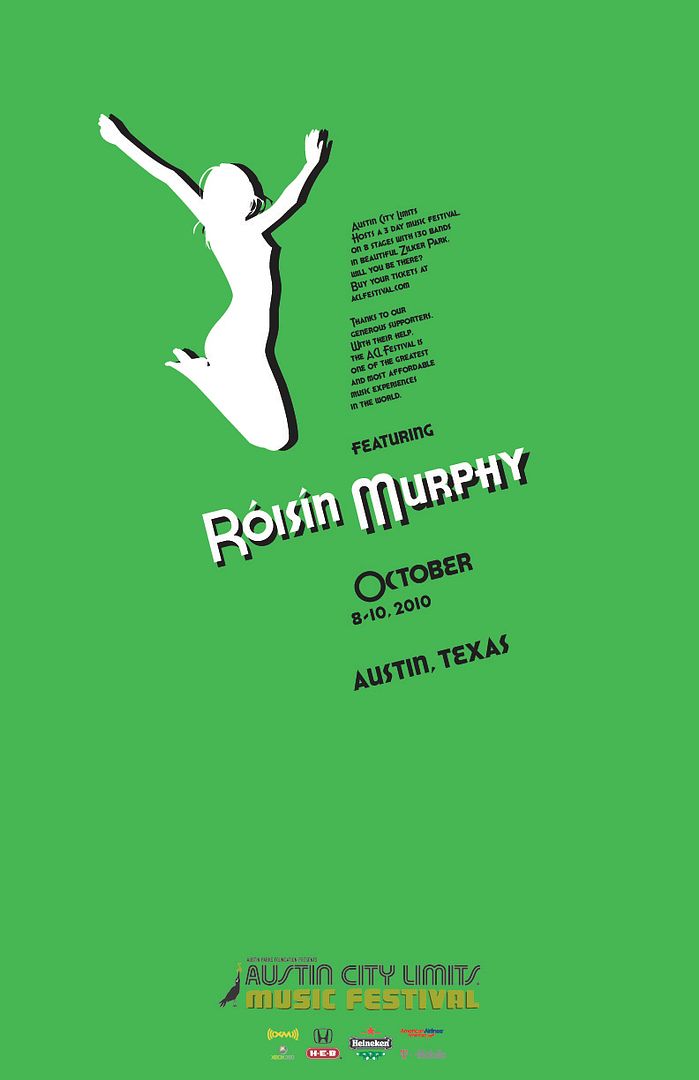
Haha, I enjoyed this the most of any project we've done this semester in type though. It is a companion book, sort of an info guide that you would receive at or prior to the festival. It had content that was provided and we just had to add one band of our choice, (obviously I chose Roisin Murphy) and think up a cool design. Oh, and the book had to employ a grid system, as all books should. Here it is:


The size of the book is 4" x 5".  As always, clicking on images allows you see them at full resolution.
The rest of the book can be seen after the jump

Tuesday, April 13, 2010


This was a page that I had designed for an information booklet that we are currently designing in type class. We had 2 concepts due and this was part of my first one. I like it but my second book was working better so this goes into the garbage, or something like that. Oh well. Moving on.

Wednesday, March 24, 2010

Record Packaging

1' x 1'

For about the past week we've been working on making record packages for our Form/Comm class. Before we knew the final direction of the project, we were just illustrating how we thought the song "sounded". I wasn't too thrilled with it at that point, but as soon as the project had a solid concept and form, I thought it was really cool.  

I chose the song Röyksopp Forever by Röyksopp.  We had to then create a 7" single and a 12" album. (The album was the album the song came from, but the imagery was to be inspired by the specific song still)  Ashley guided us to make the album and then make the single be a "teaser", a simplified version containg just one or two elements of the entire album artwork.  


1' x 1'


7" x 7"

By the way, we were responsible for everything, from the outer cover, to the inside sleeve and the paper circles on the center of the vinyl. The only thing we didn't handcraft was the vinyl itself, but we did have to buy that from a local record store.

UPDATE:
This piece was featured in the 2010 Not Yet Famous Artists Revealed UD Undergrad juried Art Show, and won the Illustration Award.

Friday, February 19, 2010

ACL poster series: Week 1

The first week of the poster series is based around the axial typographic system. I have made 3 posters so far, but can only turn in two.  I've got to figure out which two those will be...

#1


#2


#3

Thoughts?

Saturday, February 6, 2010

Second Illustaration of the day Say WHAT?

After months of testing different combinations, I think I've finally created the perfect burger at Burger Studio (Trabant Food court, University of Delware).  I could probably eat this every single day.

I'm thinking about sending this in to Burger Studio, just for kicks.

I've been neglecting you Blogger

I realize I have a different set of followers for my blogger than I do for my tumblr, which I guess is part of the point of me having both of them.  I have been doing really quick illustrations and type work and posting them to my tumblr, but I guess I should be posting those here too.

I call this one, Time For Bed