Wednesday, May 27, 2009

Randomized Album Covers

I got this idea from facebook.

Here were the directions:
1 - Go to Wikipedia. Hit “random”
or click
http://en.wikipedia.org/wiki/Special:Random
The first random Wikipedia article you get is the name of your band.

2 - Go to Quotations Page and select "random quotations" or click
http://www.quotationspage.com/random.php3
The last four or five words of the very last quote on the page is the title of your first album.
*Note, at the bottom of the page, check all of the boxes, and click New Random Quotations.*

3 - Go to Flickr and click on “explore the last seven days" or click
http://www.flickr.com/explore/interesting/7days
Third picture, no matter what it is, will be your album cover.

4 - Use Photoshop or similar to put it all together.

This is the first one I a made which I posted to facebook:
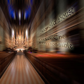
I liked the idea a lot and decided to make more. Some pictures and artist names and album titles at first seem like they don't really go together, since it is random, but I found that the type you use, design/layout, and any artistic input you have really can make it look like an actual album cover.

I really enjoyed doing these, and probably will add some more at some point.


If you have the time, make some, they're fun. If you want, you could email me yours and I might post them.

Wednesday, May 20, 2009

Final Design Project

This Blog template doesn't seem to like this widescreen video, so you may have to open up
the video in a separate youtube page to see the whole thing.

As with a lot of art projects, this one took a lot of twists and turns.

My first idea was to create a cat head that would move back and forth and nudge the viewer the way that cats do. I love it when they do that.

Dave pushed me to be more abstract. He just wanted to see a moving furball. He suggested I use the same material I used to cover my strainer for the covering project. Works for me, I thought, free materials are the best.

I spent hours making up gears, rods, belts, etc. creating a contraption that would make an outer, furry, skin move. Once the insides were finished, I covered them with a black plastic trash bag so I could then cover that in the vacuum lint. The only problem was that the rods didn't want to stay vertical and kept running into the gears. The bag would also get caught in the gears. Some of the gears didn't even want to move with the bag wrapped around them, there seemed to be too much stress.

This is when I had to move to a less organic shape and make a more square, almost bed-canopy like structure. This worked much better and even held up once I applied the fur.

Sigh. Relief.

Also, by the time I was done with everything, I was tired of explaining to everyone that this was an abstract cat, and decided it would make more sense to just call it a dust bunny.

Friday, May 15, 2009

Final Drawing: Project 7: A Global Issue

Waterboarding
26" x 43"
Ink and Pastels

For my 'global issue', I chose waterboarding, a type of torture that is very relevant and controversial right now. They say it feels like drowning for the victim, so I wanted to display the sense of drowning. That is shown by the water and hair. The blood represents violence. The flight plans are the actual flight paths from 9/11 and the drips show the actual process of waterboarding, in which the victim lays on their back with a cloth covering their face, and water is slowly dripped onto it, simulating drowning.

From the project sheet:
"...create a drawing that uses all of the formal elements of design to communicate your point of view... You may not use type...Drawings should not be highly representational, but there may be some aspect of the representational present. This should not be a narrative, comic strip, or illustration. Research drives the drawing. You will not know what the drawing looks like until you are deep into the process of research and exploratory drawing."

Basically, we have to communicate an idea, feeling, or opinion without being representational or illustrative.

Great Commercial


LOL, I think this is a really clever and funny commercial.
Just thought I'd share it with everyone.

Monday, May 11, 2009

Research Studio Project 5

My first idea for this project did not work out. I planned to tie my feet and arms to someone else's feet and arms and we would walk around town, one in front of the other as if we were one. The materials kept breaking and it was really difficult to get in sync. Given more time and help, I could make it work, and I will keep this idea for later maybe.

Plan B:

Over the past 2 days, I scrambled to think of a new idea that I could do in a day or two, as the project is due on Tuesday. I went back to this part of my research:


This is a video of Bruce Nauman playing with the skin on his face for two minutes. It's pretty gross watching it. I decided to update that idea by having a close up of me eating disgusting, fast food. I ate a cheeseburger, french fries, coca cola, and pizza. I felt horrible afterwards.


I recorded in a dark room lit by a blue light. The blue light was meant to signify the theory that the color blue stimulates appetite, but that color doesn't really show up in this film very well; again, I was in a pinch. I'm not particularly proud of this project, but I hope to make up for it when we crit the duration project later this week.

Speaking of the duration project, I showed it to Dave today. He seemed to like it okay. I guess no one has ever told him how much he says "again" because when I told him the concept, he asked "What do say that a lot or something?". He seemed amused though.

Wednesday, May 6, 2009

Authenticity

This is the comic strip I created about the concept of 'Authenticity' for my Art History Class.

Verfication

These strange verification words interest me. As a comment, just post the "word" they give you. If you are signed in as a blogger, you'll need to sign out. If you want to comment more than once, go ahead. I'll leave the first comment. :)

Tuesday, May 5, 2009

Dave is DONE

Four Hundred Forty Two.

That's the final count as of tonight. I think this was the last colloquium, but even if it's not, the project is due soon, so I have to stop here. It actually filled up the page quite nicely. I've settled on this design and gotten positive feedback, so I'll print it out tomorrow.

It's going to be awkward when I show Dave what I've done...

Drawing 6: An Establishment

25" x 19"

Drawing 6 is to draw an establishment (somewhere with walls that does something) in the pastels. I drew the park next to Cosi that has war veterans memorial as well as including the restuarant and some of mainstreet. I was inspired to draw outside when it was beautiful earlier this week, only to find out it would rain every day afterwords.

Monday, May 4, 2009

Open the Floodgates

I started the Kinetic sculpture tonight. Right now, I'm making gears, and cardboard is a good material for that because:
1. Its free (from the dumpster)
2. The ribs make good gear teeth.
But it just makes me remember last semester's cardboard sculpture and how it made my nose bleed everyday. Right now, I'm suffering from spring allergies, so that plus the nose bleeds is NOT going to be fun.
I don't think I'm going to reveal what I am doing for my project just yet. I do have an idea, but i'll keep that unknown for now. It is going to be abstract though, so you probably don't even need to know.

Before the Rain...

These were taken on the last day of sunshine before this week of rain and nasty weather started. It seems like we are just going to bypass spring and go straight from winter, through horrible weather, and on to the extreme heat of summer.

Hopefully we get to enjoy some of May soon.

Saturday, May 2, 2009

My first gallery showing.

I submitted 3 works for the Not Yet Famous Artists Revealed undergrad art show(juried exhibition) and this one was chosen to be included. It's my Say Aha! poster from Intro to Digital Media Class. The gallery will be open from May 6th through May 20th. The opening is May 6th from 6-8pm and awards are announced at 7.

Because the show runs until the 20th, and portfolios are due the very next day, I am going to have to reprint this so I have a copy for my portfolio. Unfortunately, I seem to have lost this file! The image above is a photograph of the poster, but it is not 100% clear. I will have to recreate the whole thing, because I think I still have all of the photos and other elements I used to make it. That's the importance of being organized I guess. This will be an opportunity to fix the 'phallic symbol' my teacher spotted. haha.


Update:
I found the file on my external hard drive!

400

I've been working on finalizing my design for the Dave "Again" poster. Its due on the 14th. I think I am going to count how many times he says again one last time this week, that is if he even talks this week. Right now the count is at 400, and it very well might stay there. We'll see. This is what I have with again X 400:
Kind of a graphic approach. The words just stop right in the middle, indicating it is a specific amount, and not just enough to 'fill the page'.

I kept working and came up with this:
More 'photo-real". I think I like this one better.

Let me know what you think.