Sunday, February 28, 2010

Typestream: Bad Design


This isn't so much bad type as it is bad design. My big gripe with this packaging design is the inconsistency. These two bottles are Parrot Bay drinks, but the design on them is completely different. I understand giving each bottle a little personality to go with the drink but they look like they were designed by two different people at different times. I think there should be some consistency in the design of these two products.

F is for Flapper


About 12" tall

For this 3D dropcap, I decided to continue working with F.  
I drew inspiration from flappers/the roaring 20s/Art Deco.
Obviously, because of the fringe, this piece looks a lot 
better in person when you can see it move.

Tough choice, I need the help of fresh eyes

THIS?

Or THAT?

Let me know what you think.

Friday, February 26, 2010

Róisín Murphy: Overpowered


Roisin Murphy - Overpowered
Uploaded by misslupin. - See the latest featured music videos.


Here is a video of Róisín Murphy. This is one of my favorite songs of hers.

Radial Posters

I'm sure that these are not finished, and I may even come up with a new one to replace one of these, we'll see how much time I have.  But any critiques and suggestions on these are very much appreciated.


Process: Feb 26


For this weeks (3D) drop cap, I was inspired by the style of Art Deco of the ~1920s. I am constructing a letterform out of cardboard, as a base, and part of it will be covered with fringe, resembling a "Flapper".

Here is the beginning of the letter:


I will hopefully finish it this weekend and I will post pics of it as soon as I'm done.

Here is what I have so far for the first radial poster:


The radial system is actually very difficult to work with.  For the next poster, I am going to try centering the radius and going landscape.  My inspiration for the next poster is Roisin's love for fashion. I'm going to try using this image of a peacock:

Sunday, February 21, 2010

Poster Process

I started with this graphic of chromosomes. I got that idea from a line in one of Róisín's songs "Overpowered".
When I think that I'm over you
I'm overpowered

Your date on my data
The chromosomes match
Exact as in matter
A matter of fact
I then extracted one of them in Photoshop, and played around with how I wanted it to look in Illustrator.

The next step was to add text.


I had to play around with typefaces and what font size to use for all of the different text.


Background color required some tough choices:

This also made me think about if I wanted to use color for any of the text.


Somewhere in there, I also added text to the background for texture. It reads 
AUSTIN CITY LIMITS MUSIC, although that doesn't really matter.


I added the logos last since I created most of the poster before I got ahold of them.


To continue my process...I created two additional posters after this one, and ended up liking them better, so I don't think I will use this one to turn in.

Revision of Dropcap

Here is my updated drop cap, which was inspired by the work of Piet Mondrian. Using criticism from the class critique, I removed part of the stem of the letterform because it was too long. I removed the awkward space between the stem and the arms as well. I also changed the gray squares to white with black outline because the yellow was getting lost.  I think without the gray it looks more Mondrian-esque anyway.


               Revision                                 Original

Friday, February 19, 2010

GAGA MATH


Inspiration:
Still from her upcoming video.

ACL poster series: Week 1

The first week of the poster series is based around the axial typographic system. I have made 3 posters so far, but can only turn in two.  I've got to figure out which two those will be...

#1


#2


#3

Thoughts?

Wednesday, February 17, 2010

Austin City Limits Music Festival

Our second ongoing project in Type II is to create 2 posters a week (each week will be a different organizational system) advertising a musician playing at the Austin City Limits Music Festival.  The 2010 lineup is not actually released yet, so we can really just choose any artist we want.  I have decided to go with , Róisín Murphy. On my tumblr I have uploaded her latest song so you can go there to have a listen.


The first typographic system we are learning is called the axial system.  This uses an axis to which the type alligns. Here are some googled examples.


This is actually the cover of my textbook, and that is 
a list of all of the systems we will be learning this semester. 


A diagonal axis, and some breaking away from the axis.


And here is Róisín Murphy :)

Tuesday, February 16, 2010

Weekly Drop Cap #1

This is the first drop cap I designed for my Type II class, as part of our weekly series.  This first one was very open; we could design any letter, in any style.

I drew my inspiration from abstract artist Piet Mondrian.

Monday, February 15, 2010

Owl Wallpapers

I decided it was time for new computer wallpapers.  I was getting tired of all my old photography from last year.

You know what I'm not tire of? OWLS

And here's 15 of them! I've got to waste my time making something, right?

I have my computer cycling through one every 5 minutes.

Type II

My Typography II class finally met today because the snow can no longer keep us away.  The new teacher seems great and having a fresh point of view and teaching style can't be bad.

We are required to to keep a blog and a twitter for this class.  I decided to just use my already existing blog, but as for twitter, I created a new account.  That one (@lmaobrb) will be separate from my actual twitter and my first one will remain private.  Even though I didn't really tweet art stuff too often before, anything I have I do want to share, I will do so with my new account. The old twitter will stay strictly personal.  In addition, I will label all of my blog posts as Process and/or Inspiration and or Type II, so you can easily find these posts in the side panel.  We are required to post twice a week, once for something that inspires us, and once for something showing our process.

I will use this first post for Inspiration.  I have been listening to MGMT for probably about a year now, but during this past month, I have been especially into them.  On my LastFM page, they were the top artist this past week.  I love their sound, it's very old, reminiscent of The Beatles, but updated with a more electronic approach.  Their logo is really awesome though.  I was admiring it this past week.  So that was the first thing that came to mind for inspiration.
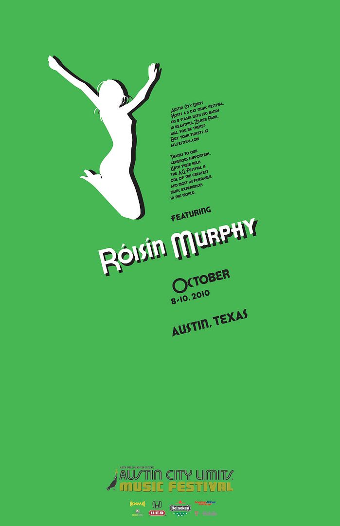
I think that it works better vertically and that is probably how it was designed, since it appears vertically on both of these album covers, and the logo at right was found on a music festival's website.  The latter logo is also not in outline format, which I think further makes it suffer from the original design.

One last note.  I was recently thinking about things I collect.  They're actually not so much collections but rather, things I like to buy, many times over.  I can't imagine these things don't inspire me somehow...
  • Glasses. Any kind of glass drinkware.  Tumblers, Tall glasses, shot glasses.  If I had more money, I would surely have more glasses, but not necessarily more drinks.
  • Scarves. I won't stop until I have every color.  And then I will by other hues and patterns in the colors I already have.
  • Belts.  I feel these are a very important and critical accessory to an outfit.  Sometimes, I wear a relatively plain set of clothes, and make the belt the focal point.  This would be easier if I had more belts though.  My most recent buy was a white leather belt.  Good purchase. 
  • Flip Flops.  Storage for these is tricky, but it doesn't stop me from buying them.  Usually I only buy them once the weather gets warmer, obviously.
  • Assorted Papers.  I haven't actually bought all that much of this.  I have a bunch left over from a project last year, and my roommate stole a bunch and gave it all to me.  Plus, I save scraps from any projects I have worked on.  It comes in handy very Often, and the pile of it under my bed seems to always contain the same amount of paper, as if it is self sustaining.
  • Blankets.  I LOVE BLANKETS.  I currently have 4. The one on top, I've had since I got my first real bed, which was probably around 4 years old? Not really sure, but it's old.  I want another blanket to add to my collection.  Now that I am in my own house, paying for heat, I've set the thermostat at 65 degrees.  More blankets are always welcome.
  • Typefaces.  I am a nerd, and I am proud.  I love type.  I have been downloading so much of it.  I follow probably about 4 or 5 websites that offer free downloads of typefaces.  They are very useful for design, so I'm not stuck with Times new Roman, Helvetica, Futura, etc.  One that I want that I know would not be offered for free: Stymie Light.  I used it in Raven Press, fell in love, and now I want it for my computer.
  • Sketchbooks.  I really got on a sketchbook kick lately.  I was buying and making sketchbooks, and I really never use my sketchbooks that much.  I know that's bad, and the fact that I have 9 sketchbooks that are either partially or completely empty will hopefully inspire me to sketch/write more.  I have already designated my hardcover book I made over winter session as my dream journal.  I am going to start writing down all the dreams I remember and maybe one day turn it into a blog.

Saturday, February 6, 2010

Second Illustaration of the day Say WHAT?

After months of testing different combinations, I think I've finally created the perfect burger at Burger Studio (Trabant Food court, University of Delware).  I could probably eat this every single day.

I'm thinking about sending this in to Burger Studio, just for kicks.

Epic Snow Storm! Illustration for the day


Ehh, Blogger really can't handle the colors on this one.  It's already a very washed out illustration because of the all the white but this website doesn't have good contrast.  It looks a bit better on my tumblr.

I'm proud that I've been keeping up with these sketches for the past few days.  Good practice to keep my creativity going and working up my skills.  I'm not sure I will have much time for these starting next week.

I've been neglecting you Blogger

I realize I have a different set of followers for my blogger than I do for my tumblr, which I guess is part of the point of me having both of them.  I have been doing really quick illustrations and type work and posting them to my tumblr, but I guess I should be posting those here too.

I call this one, Time For Bed

Thursday, February 4, 2010

Logos for Ohio Puppy Rescue

Earlier this week, my aunt approached me about designing a logo for a Puppy Rescuing volunteer operation she works with.  They are a branch of the Delaware Puppy Rescue but she didn't like that they were still using the Delaware Puppy Rescue logo.  She asked if I would design a new logo for them.  Obviously I was thrilled to do so.

She only required that the logo include OPR and Ohio Puppy Rescue.  I made it a goal to design 5 different logos by the end of the week.  So here are the variations of the five that I designed.

They are presented in the order that I made them.  At first, I tried working mostly with the colors on the website, which were orange, yellow and brown.   But then I decided to stray off of that color scheme a little bit.  I also made a progression from using the image of Ohio, to illustrating a dog, to using letters as a logo.  3 different approaches.  I can (and almost expect to) make modifications, so suggestions are encouraged.  

Click on the picture to see a larger version.

Update:
I modified a few of the logos and cranked out a few new ones.  I used the red and orange color scheme people seemed to like.

Tuesday, February 2, 2010

My Spring Class Schedule

  • ART203 Typography II
    • Definitely the class I'm most looking forward to.  I love typography, and the teacher is awesome.
  • ART207 Form and Communication II
    • "Graphic translation and representation, semiotics, intention to communicate" sounds like my first real dip into "graphic design".  Should be fun/interesting.
  • ART231 Painting I
    • I am both nervous and excited for my first painting class. I've not done much painting at all before, but everyone I see take this class always comes out having learned so much and gotten a lot better, so this class seems to have a lot of potential.  I can't wait to just dive into painting.
  • ARTH245 The American Home
    • This will be my 3rd art history class; I need 4 for my major, and 6 for a minor, which I am still not sure if I will go forward with.  This seems like an especially anthropologically driven art history course, so it could be cool.  The major downside to it is the time: 6-9pm tue nights.
  • CISC103 Intro to Comp Sci with Web Apps
    • Gonna try my hand at some html, java etc.  Not really all that excited, it's just one of those things I need to know.  Maybe one day it will help me make a killer website to advertise myself or for a client.  It is also the first course in the interactive media minor.  In all honesty, I don't think I will have time to complete that minor, but I will benefit from the classes I do have the time to complete.
For the first time, all of my classes are in some way connected to Art.  The first four are obvious, being studio classes and an art history.  The Computer science class I am viewing as art relate however because the reason I am taking it is for art.  Learning how to design websites and whatever else we will be doing will aid me in my future artistic exploits.

In addition to all of this, I am taking an increased leadership responsibility in LBO, a group in which the students of my major meet up with each other, and the fashion/VisComm majors have a Joint project called Synergy, and that is really taking off this spring.  So I will be super busy.  I'm actually kinda worried, but I know I will make it through.  Wish me luck