Tuesday, September 29, 2009

New Blog Feature: Labels

So I decided to add labels to all of my posts, which are conveniently totaled up on the right-hand side of the blog. If you want to look at all of my posts related to...drawing, you can click on that label for a list of all of the posts related to drawing. It also shows size variations between the labels to show which ones occur more often. (Photography is currently my most blogged about subject)

Wednesday, September 23, 2009

Now I'm starting to understand Illustrator...kind of

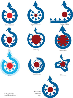
This is actually our second assignment in the Mac Lab. Our first was just an article layout. Not anything special. This project was fun. The task was to take a Logo, and use Adobe Illustrator to first draw it, and then manipulate it 9 times to show different emotions. The point of drawing it is because in illustrator, things are made out of vectors rather than pixels. This means you can create smooth curves and all kinds of shapes that you can change and resize and they will never get blurry because they aren't made of pixels. The emotions/traits we had to show were:

  • Contentment
  • Glee
  • Agressiveness
  • Timidity
  • Submission
  • Arrogance
  • Grief
  • Vulnerability
  • And one or more of your choosing
My last one was just me playing around with different tools on illustrator, I came to that design, and thought it looked like distress. Voila

Wednesday, September 16, 2009

Beginnings of Heath


This is my first line drawing of Heath. My teacher liked it. There are a few things I can fix, but I think I will stick with this idea for my 'open' design.


I started this cross-hatching board with the quill and ink, but when I brought it into class, she said it was getting too dark in parts. Since there's no way to take ink away, I must restart.


This and the following two boards are my preliminary tracings for the graphic board. I think the latter two definitely look better than the first one, but she said I need to simplify even more, and connect the shapes more.


Illustration Project 1


5" x 5"

The first project in this class was to illustrate the conversation between the U.S. and North Korea. We had to use black and white medium. We could not show people.

I am showing a telephone to N. Korea that is disconnected at the wall, symbolizing that conversation just isn't happening. My teacher said it was a good metaphor.

I got a 3 out of 5 as a grade.

Tuesday, September 15, 2009

Illustration Project 2: Interpretation

I know, I know, I haven't even uploaded Project 1 yet. I forgot to take a picture of it before I turned it in, so I'll have to do that when I get it back. but heres a preview of our next project.
We were told to find a picture of a famous person, whom we would produce 4 different images of. My first thought went to Anna Wintour, editor in chief of Vogue Magazine and inspiration for the character Miranda Priestly in The Devil Wears Prada.
The problem is, the pictures had to have enough facial information in them, which means that they have to have appropriate lighting (no flash) and can't be airbrushed. Trying to find a picture meeting those conditions in a magazine that I could photocopy was almost impossible. So searching for a particular celebrity was nixed. I found 4 suitable images. Heath Ledger, Madea (Tyler Perry), John Waters, and Margaret Thatcher. I decided that Heath Ledger, while the least interesting of the four famous people, was the best image.

The 4 images we must produce are as follows:
(in no particular order)
  • Cross-hatching with quill and ink
  • Scratch-board
  • Graphic image using only 2 values (black and white)
  • open choice (I'm thinking about a line drawing)
I'm almost finished the cross-hatching, so I may upload that soon or just wait 'til I'm finished everything. I also plan on starting the Graphic board today.


By the way, the first image is the actual image of Heath I'm using, only i've since cropped it to focus more on his face (requirement)
Also all 4 boards are 6" x 6"


Saturday, September 12, 2009

Yea. I work for Sesame St.

Hooray for blogging again! :) I forget how to do this. This is for typography class. I am painting letters from the Akzidenz Grotesk typeface. Well that's after I spent 20 min chasing the squirrel out of the studio. Okay, back to work for me, I still have to do an a and an h. I already finished the g and o. I don't want to keep Big Bird waiting.